
Friday, June 27, 2014
Brianna's Cyber Hand!
Alanna, Heart of the Country!
My first heart was taken on top of a rock up on the Blue Ridge Parkway,
it is very simple. I definitely could have added more materials to it,
however, to me when I'm hiking through the mountains it is the least
materialistic place to be, and everything
is as simple as I can imagine. In this image, repetition is found from
the leaves, sticks, and rocks used. It is near symmetrical due to the
heart not being measured precisely, and my feet being added to the photo
to add scale. This photo is a great example
of texture due to the roughness of the rocks that is shown through the
image very well. I used a basic color scheme of neutrals, yellow, and
green to stay with a natural theme of the woods. The single yellow
sunflower is standing alone in the center of the
heart to add emphasis.

Matthew Shares!
The natural piece has a shallow space, neutral colors, real texture, and a symmetrical balance.

Samantha and Sons!
THE second piece was from my youngest sons toys or our floor
decorations. This shape is also geometricwith real texture. I used
several colors so it is polychromatic. IT is also a shallow space
that is symmetrical. There is repetition with the toys and color. The
emphasis of this piece are the soldiers in the center.

Karen's All American Heart!
My 4th of July heart is made from sparklers, pop-its, glow sticks and a
flag.The colors are .polychromatic. There is variety in different items
and a repetition and rhythm in placement..The texture is real. There is
line that is implied at the
top of the heart to make its shape.I would say balance is informal
because not quite equal on both sides..The emphasis is on the flag which
in proportion to other items is large.there is also geometric shapes.

Katya B.'s Sweet Heart!
The first image is composed of cherry tomatoes, dried blueberries,
Lifesavers, Jolly Ranchers, peppermints, and MnMs. All of the things I'm
not really supposed to have unless my blood sugar has hit 70. I tried
for formal balance/symmetry to convey my attitude
towards candy - look but don't eat. I utilized color to add variety,
and attempted to establish a rhythm by alternating the Jolly Ranchers
and Lifesavers by color. However, because I didn't have enough of
certain colors, the the repetition wasn't perfect,
which also amounts to have a near-symmetry rather than formal balance
overall. The relationships between colors are varied. For instance, the
red, white, and green colors don't fulfill any triad, but red and green
are complimentary and white is neutral. The
same applies to the Jolly Ranchers, which were red, blue, green, and
pink, giving a mix of both cool and warm colors.

Sherry H. Keeps the Balls Rolling!
Heart #1 For the love of the game
Texture-real, variety-yes, inside of the heart is all of the
things that are used at the ballfield. Space is shallow. Emphasis is on
the baseballs that outline the shape of the heart and they set the tone
for what is inside of the heart. There is repetition
in the the outline of the baseballs but not for what is inside. No
proportion/scale but there is unity.

Laurie S, Lets the Good Times Roll!
FIRST PIECE:
GAMES OF THE HEART
The emotional game the mind plays
with the heart when you are in love gave me inspiration for this piece .This particular
piece uses a referential heart shape. Pieces from poker chips, playing cards,
pool balls and dice form a nearly symmetrical image. All of
these games pieces are geometric shape. The texture is real. This piece has
mainly neutral colors with touch of unilateral warmth. The darkness of red chips
and the lightness of the white chips could create a sense of value. There is no rhythm but maybe some repetition
with the colors and shapes. All of the pieces used were found around my house
so I guess it’s economical. The negative
shape from the back drop gives a sense of deep space but this piece has height,
depth and width so it is an actual 3-D image.

Thursday, June 26, 2014
Ozan blows my mind!
1. Button Heart: I am the repository for both of my
grandmothers and mothers sewing leftovers and as a result have
accumulated a lot of notions. Some of these buttons I recognize as
extras from clothing that was made for me and my siblings when we were
younger.
-Color Harmonies: this is polychromatic, utilizing neutral, cool and warm colors.
-Texture: This has real texture
-Balance: Symmetrical balance. Although each specific button may not correspond exactly, the color, type, placement and shape of buttons correspond on each side.
-Repetition: The interior heart and exterior heart repeat, as do the circular shape of the buttons and spools of thread
-Emphasis/Focal point: The red interior heart draws attention to the center of the piece.
2. Salad heart: We like to eat our vegetables! There is a salad of
some sort at every dinner in our house and we are fortunate to be able
to eat together most nights. Eating together is an important ritual for
our family.
-Color harmonies: This heart uses a combination of warm and cool colors
-Texture: This has real texture
-Shape: This is composed of items of organic form
-Value contrast: The light of the cheese against the dark of the
spinach leaves and tomatoes, the pale green cucumber against the vibrant
carrot
-Emphasis: Placement and repetition of colors/patterns creates emphasis
-Repetition: There is repetition in the lines of carrots/cucumbersEric's Tough Heart!
For the second one I had the idea of an exploding
heart. Again my mental image was not quite realized. I used split
wood, two branches, a splitting maul, and the previously un-split
section at the base. It was raining, so the gravel
under my shed became the background.
Again, there is lots of repetition: the angles,
grain, and colors of the split wood. There is a sense of rhythm created
by all the wood falling away from the maul and the viewer. The darker
branches were supposed to accentuate that rhythm,
but…
There is a little variety. Mainly resulting from
the difference in shade between the split wood, stump, and branches.
The yellow handle of the maul provides variety of color and texture.
This is again near symmetrical and that is true to
the idea that I had—the symmetry of the heart was to balance the chaos
of the exploding stump.
The emphasis appears to be in the bottom of the stump.
I would say this is an example of three-dimensional space.
Everything is proportional.
I attempted to use the lines of the split would and
the branches to create the sense of explosion. There is also straight
lines created by the split stump and the maul.
The texture is real, definitely rough.
Value applies more than color. There are certainly
different colors in the split wood, branches, and base, but they are
all sort of different values of the same substance.

Bethany M., Queen of the Stone Age!
Love in Nature
Repetition: The rocks are repeated throughout the art piece along with the heart shape.
Variety: Variety of nature: Rocks, sand, leaves, and mulch
Balance: The shape and color of rocks make both sides different,
but with the shape of the heart consistent keeps the art work balanced.
Rhythm: The heart shape shows rhythm as it goes from leaves, to sand, to rocks.
Emphasis: The 3 heart shapes leaves with smallest inside the one
and medium leaf inside larger leaf makes the eye go directly to the
center, and with the green of the leaves stands out with the neutral
colors.
Texture: The rocks give a rough feel, then with the coolness of the sand, and smoothness of the leaves.
Color: Monochromatic, Green w/
 Neutral colors: Brown, and White
Tuesday, June 24, 2014
Carla H. Shares her love!

Ilovewine!
These are materials found in my husband and I’s wine and
spirits bar.
Repetition: Wine corks, stoppers, wine foil cutters, mixed
drink strainers, and wine glass charms evenly and symmetrically surround the
wine corkscrew in the middle.
Variety: Wine corks, stoppers, wine foil cutters, wine glass
charms, mixed drink strainers, and a wine corkscrew.
Rhythm: Beginning to end. Strainers, foil cutters, corkscrew
and corks prepare the drinks, the wine glass charms identify the drink while
drinking it, and then the stoppers close the remainder.
Texture: Real
Shape: Geometric
Balance: Symetrical
Color: Polychromatic. I tried to separate the cool from warm
colors on each side of the heart. Most of the colors are tertiary,
complementary, and neutral.
Space: Shallow
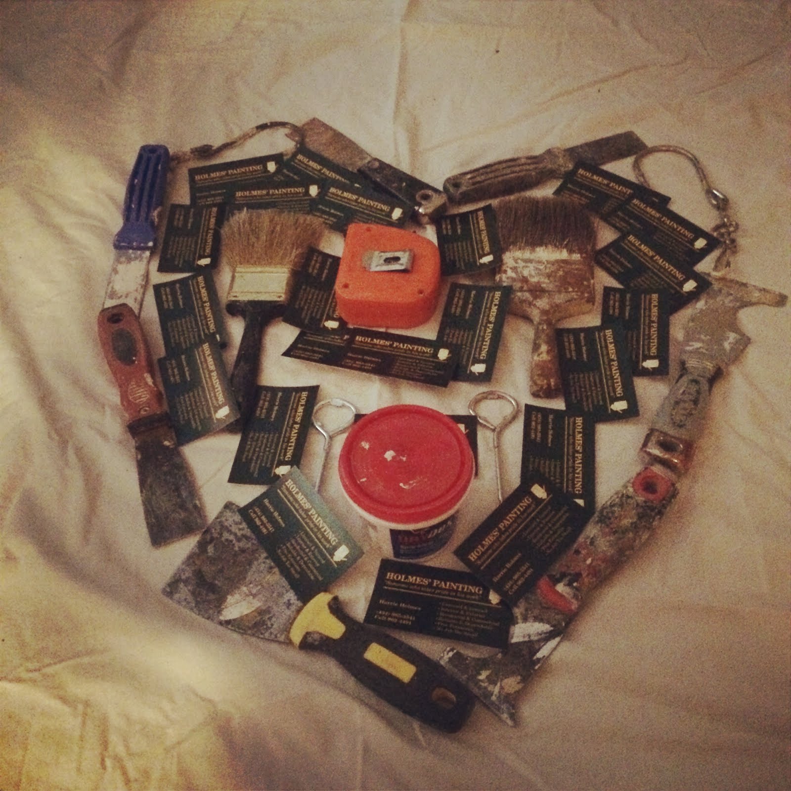
Shirloyn's love story!
Painter tools Heart
My husband Harrie is a self-employed painter. This heart is made up of items he use in his job.
Repetition: Putty knives & placement of brushes, 2 lid openers, bucket hooks placed evenly around heart
Variety: Putty knives, spackling, brushes, measuring tape, 2 lid openers, bucket hooks
Rhythm: Metal objects outside, business cards inside
Texture: Real
Shape: Geometric
Balance: Putty knives, brushes & hooks inside (informal)
Color: Orange, red, blue, black and yellow. Majority Primary Triad
Space: Shallow
Monday, June 23, 2014
St. Valentine... meet St. Augustine!
This is a referential shape, and color is polychromatic.
Balance
is near symmetrical, and there is repetition with emphasis on the heart
shape in the middle of the project. The project has variety, and real
texture
with organic shape.

Friday, June 20, 2014
Don't mess with Texas OR Lauren M.!

LAW ENFORCEMENT HEART
This heart is made up of items my boyfriend uses in his law enforcement job.
Repetition- yes, this is on the patterns and the placement of the bullets.
Variety- comes from the type of bullets, the whistle, hand cuffs and magazine clips
Rhythm- yes, the larger more powerful bullets are on the outside, the less are on the onside.
Texture- yes, all exist in real life
Shape- geometirc
Balance- balance is in the placement of the ammo and is the same on each side, informal
Color- red and blue, and mostly metallic, but mostly come form the primary color triad.
Space- this is a shallow space.
Victoria H. is Cookin!!!

Susan L. tells her story!!
Recently, in my household we have had many reasons to celebrate
with multiple graduations and holidays. Also, when your husband is
employed by a beer distributor like mine...beer is just stacked in our
garage craving an ice packed cooler! So, I decided
to use the beer as well as some of my husband's freebie aluminum can
koozies that clutter the back of his work vehicle. I borrowed the
bottle caps from my children's "art collectibles" bin to help provide
the inner heart filler.

Repetition: Exists in many forms in this piece. One way is
the circular shapes of the components with the minor exception of the
koozies. Repetition also exists in the design of how each component
continues to generate the heart shape as it spreads
out from the core.
Variety: Exists in the different types of beers and beer
containers that are incorporated into the design. The koozies and red
solo cups also serve as a variety element in that they both have an
intended manufactured purpose to "hold" the beers.
Balance: Near Symmetrical, I was unable to achieve perfect
symmetry with the bottle caps in the middle of the heart. As well as
with the koozies on the perimeter of the design.
Rhythm: Achieved in the spacing of the different components
around the core as they spread outward. Rhythm exists in the repetition
of the circular shaped objects used such as the bottle caps, brown beer
bottles, aluminum beer cans, and the solo
cups that generate a pattern from the inside to outside of the heart.
Emphasis: The red solo cups are the focal point mainly
because their rich red color explodes with the bright orange colored
koozies as their back drop.
Unity: Oh Yeah... We typically reference red solo cups with
the consumption of alcohol. The Beer itself is unified because they are
all in a cylinder format for bottling reasons and they contain alcohol
as a similar ingredient. The circular shapes
that generate the shape of the heart from looking down on it provide
unity. The koozies and red solo cups also serve as a common element in
that they both have an intended manufactured purpose to "hold" the beers
or liquid.
Line: The bottled beers, the beers in the aluminum cans, and
the solo cups each provide some type of line as they aid the shape of
the heart. The outer most edges of the koozies generates an implied
line as well.
Texture: The design exists in real life therefore, it is real in texture.
Color: This piece is warm with cool accents. Neutral colors
of the overall concrete back ground and beers provide an increased
emphasis on the red solo cups.
Monday, June 16, 2014
Penny S gets the hearts rolling!
Heart #2 - Games of Hearts
This piece was more of a fun piece to create. I used pieces
from four different games to design a heart of fun. My whole family
loves to play games and put puzzles together so I thought how
appropriate it would be to design a heart out of something
we love. The games included Othello, Rummikub, Checkers and Blokus.
Repetition - Yes, repetition in all the games pieces and color patterns to design the heart
Variety - Yes, pieces from four different games
Rhythm - Yes, the alternating color patterns of the black a
white Othello pieces in the middle. Also the alternating red and black
checkers along the outside of the heart. Just the fact that I used all
game pieces supports a rhythm to the piece
Balance - Near Symmetrical, the inside red and green pieces
would not match perfectly to support a symmetrical piece and neither
would the numbers on the rummikub pieces
Emphasis - Color, I believe your eye is drawn all over the piece rather than one specific focal point
Line - I see vertical and horizontal lines within the green
and red Blokus pieces in the center of the heart, overall shape of a
heart.
Texture - Real texture, it exists in real life
Color - The middle consists of complimentary colors with the
red and green. The white and black Othello are neutrals because they
contrast each other. The Rummikub numbers around the heart are a
primary triad with the red, yellow and blue.

Subscribe to:
Posts (Atom)